We’ve all seen a pie chart and instantly understood a complex dataset. Yet, this same data point written out in plain text does not deliver the same kind of clarity and context. This is the power of data visualization.
What is data visualization?
Data visualization refers to the process of presenting data and information using graphical representation to illustrate important information. Why is data visualization such a sought-after technique for many companies and individuals who operate in a data-driven organization? Because a picture really is worth a thousand words for anyone trying to quickly conceptualize something and make quick decisions about it.
Data visualization allows us to simplify complex ideas and data, comprehend trends, and recognize patterns in the simplest way. Our world today places a high demand on any technology or process that can help turn the complex into the simple and actionable. This demand has caused an explosion in data visualization opportunities. With data driving so much of the business world, data visualization has secured its place among the most important solutions a business turns to.
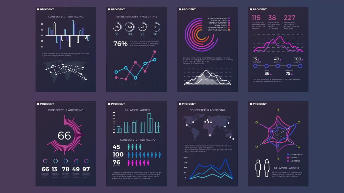
Though we all may be familiar with a pie chart or bar graph used to explain simple data points, data visualization can range from the simple to the complex. Data visualization can also refer to infographics, illustrations, video animations, charts, plots, graphs, and more. Teams use data visualization for a number of tasks such as illustrating ideas, generating ideas and strategies, and conceptualizing data in a presentation for stakeholders who are not as contextualized as the data scientists.
Why do we need data visualization?
Let’s be honest. Not everyone finds data to be particularly captivating. Everyone, however, loves a good story. Humans are highly visual creatures. Data visualization allows users to tell a story in a visual way that can captivate and engage those who may otherwise be bored with plain numbers. It allows us the easiest way to consume complicated information. It’s no simple task to be able to identify patterns, spot trends, and make quick conclusions about the macro and the micro of it all. Yet, data visualization presents us with this opportunity.
The applications of data visualization are endless. One can think of few industries or niches that couldn’t implement data visualization and benefit from its insights. Almost every business is seeking a way to discover the factors that influence customer decisions, find their areas of weakness, turn difficult concepts into easily digestible points for discussion and decisions, make predictions, stay ahead of trends, deliver information to customers that influence buying decisions through marketing channels, and more. Because of this, even those who are not technically data scientists are becoming experts within their departments at using data visualization to be effective at their jobs.
Why are so many businesses and individuals turning to data visualization to impress customers with statistics, clarify concepts to shareholders, illuminate murky landscapes for fellow teams, and more? There are several key benefits of data visualization in every facet of work. At its core, data visualization can give us perspectives on data in an easily digestible way. With this ability to absorb data quickly, companies can make faster decisions in a world that demands rapid execution to stay ahead.
The benefits of data visualization
Data visualization presents an easy way for collaboration between multiple departments. Now, there is no need for translation of data and information because the “story” is now presented in the simplest terms for all stakeholders to understand. It can help us find patterns in complex fields while putting the data within the context of the bigger picture. In turn, viewers can grasp information quickly which saves time. This time saved on absorbing data can now be spent on finding solutions for whatever problems are present in the business or organization.
Without needing to rely on data scientists to guide businesses through every small detail, businesses can save money. Anyone who is presented with simple data visualization can consider themselves a data scientist. With more complex data visualization, team members can be contextualized and gain perspective on where the data fits relative to competitors, past years, the global market, and more. Finally, this new method of visualizing data is engaging. Without the need to uncover cumbersome data from lengthy documents or tables, gathering insights can be a rather enjoyable process for overburdened teams and stakeholders.
How can we get started with data visualization?
Before companies can dive into data visualization, they need to ask themselves how they can present this data in the most easily accessible manner. For each unique data set, it’s important to choose which method of visual delivery is optimal. Creative stakeholders should have no problem figuring out this obstacle. It’s also important to keep in mind who the end viewer will be in the case of data presentations. Will this be an internal presentation? Will this be forward-facing to be presented to customers? Will it be isolated to certain experts within your organization? The answers to these questions will dictate what kind of data you present and how you present it.
No matter what method of delivery you choose (bar graph, pie chart, video animation, etc.), make sure you present this information using engaging visuals. Using the right tools for data visualization will make this piece simple. So, how will you present the data once you are using the tools? Data visualization tools offer many different methods for presenting data. Some examples include number pie charts, maps, gauge charts, bar graphs, and area charts. Design departments or team members with a modicum of design abilities should be included in the process to ensure any circulated data visualization is on brand and appeals to design best practices.
To conclude your data visualization plan of action, be sure to know what story you’re telling. Data visualization and the tools available offer a simple way to decide how you’re telling the story. But, it’s important to construct a narrative using your data. After all, data visualization is data storytelling.
If you’re trying to present data in the most easily digestible way, you’re going to want to use one of the many programs available. These programs allow you to plug in your data and choose from a variety of ways in which your data can be presented. Data visualization presents us all with a unique and easy way to learn from complex data points and is sure to undergo further evolution as data continues to impact our lives.
Here’s a list of some of the best data visualization tools.
- Tableau: A powerful data visualization tool for creating maps and visualizations for customers.
- Power BI: A data visualization tool using business intelligence to foster a data-driven organization.
- DataWrapper: A data visualization tool to enrich stories with maps, charts, and graphs.
- Google Charts: A free data visualization tool used for creating interactive charts that communicate data points.
- Plecto: A data visualization tool that creates dashboards for employees to keep them motivated and on-track.
- RawGraphs: A data visualization tool to help simplify complex data through engaging visual representation.
- PolyMaps: A free, open-source JavaScript library used for creating dynamic maps so you can display your data through various visual presentation styles.
*The opinions reflected in this article are the sole opinions of the author and do not reflect any official positions or claims by Acer Inc.

About Alex Clark: Alex is a contributing writer for Acer. Alex is a Texas-based writer and B2B email marketing strategist specializing in helping technology brands connect to their customers. He has lived all over Asia and has consulted with business clients in numerous industries to grow their brands.